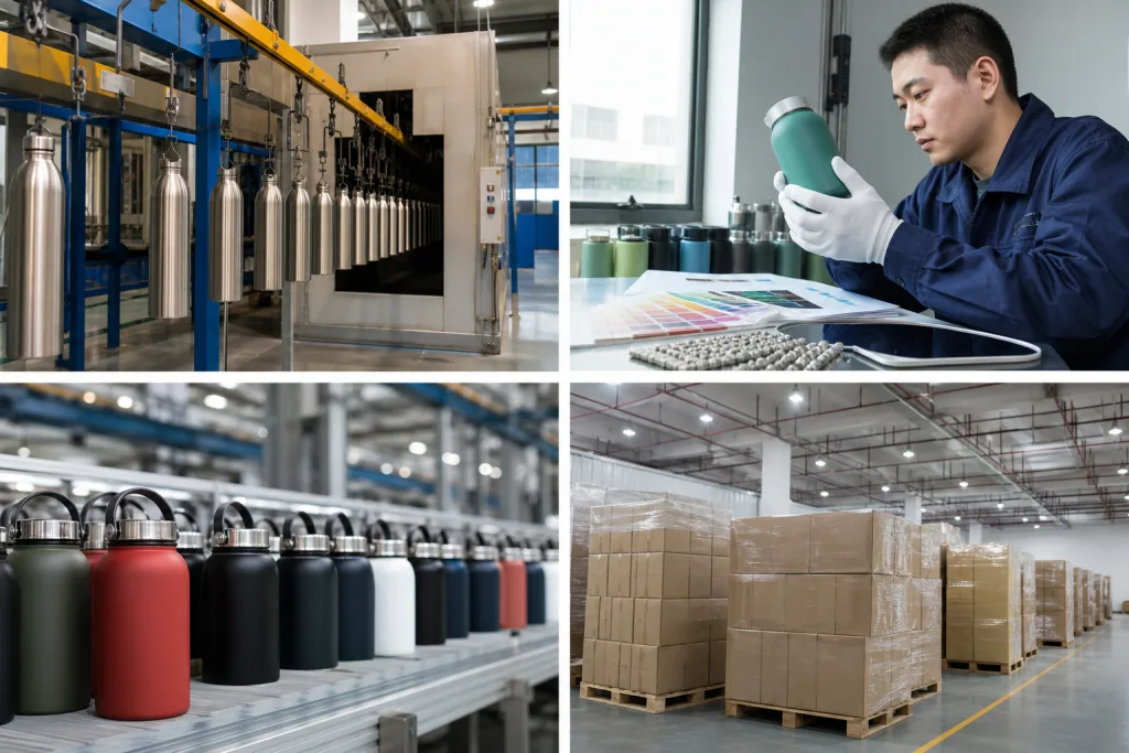
Key Takeaways
- Lock Pantone code, finish, gloss target and ΔE tolerance before sampling; for coated steel, many buyers hold ΔE at 1.5-2.0 against a sealed master sample.
- Below 1,000 units per SKU/color, custom coating cost rises fast; common MOQ in Zhejiang, China is 1,000-3,000 units depending on body style and decoration.
- Ask for cross-hatch adhesion, dishwasher, salt spray and migration test plans up front; one failed cure cycle can ruin 30% of a batch.
- Use AQL 2.5 for major visual defects and define viewing distance, light source and acceptable color drift between body, lid and accessories.
You approve a bottle color on screen, the pre-production sample looks close enough, then the first container arrives with three shades under one PO. We’ve seen this go sideways. It is usually not a factory mystery. It starts with a weak spec before the line even runs: wrong Pantone version, no agreed tolerance, no substrate note, no cure test, no golden sample, no written batch-variation limit. QC pulled the sample under a D65 light box and the mismatch was obvious in 10 seconds.
If you source from Zhejiang or another part of China, you need a color spec that holds up in production, not a mood board. At BottleForge Industrial in Hangzhou, Zhejiang, our normal MOQ starts at 1,000 units per color per SKU, lead time is typically 25 to 35 days, and output is about 300,000 units per month. Those numbers matter. Color control at 1,000 pieces is not the same as a 30,000-piece run on the same SKU, especially once line speed moves from 18 pcs/min to 26 pcs/min and film build shifts by a few μm. You are not buying ink on paper. You are buying repeatability on steel, powder coat, plastic, and print—and this is the wrong question to ask if the only thing on the PO is “match Pantone.”
Where Pantone specs usually break
The first mistake is treating Pantone like a full production spec. It isn’t. A Pantone code without finish, gloss level, substrate, and tolerance is just a target on paper. On a matte powder-coated stainless bottle, Pantone 186 C will read differently from glossy PP, silicone, or a printed paper label. We see this on the line all the time. If your PO just says drinkware custom pantone with a swatch screenshot, the factory guesses, QC guesses, and then the buyer flags the set at inspection.
For custom drinkware, the color stack usually comes down to four production variables: base material, coating system, surface texture, and curing profile. A stainless steel vacuum flask may use powder coat at 60-90 microns, and 10 microns either way can shift the visual read. A Tritan sports bottle may use color masterbatch in the resin plus pad print, so the bottle body and logo are already two different color systems. A custom canteen with rubber paint often shifts darker after cure; we check that after oven time, not before. A customizable growler with textured finish diffuses light, so the same Pantone looks flatter and less saturated. This is the wrong question to ask: “Can you match the chip exactly?” Better question: “On which part, with which finish, under which light?”
You should write the spec like an engineer, not a designer. Include:
- Pantone reference with year/version, such as Pantone Solid Coated 2024
- Target finish: matte, semi-gloss, gloss, rubberized, metallic, pearlescent
- Substrate by component: 18/8 stainless body, PP lid, silicone ring, ABS handle
- Visual standard under D65 or equivalent light source
- Allowed tolerance, either visual against a signed master sample or instrument reading such as ΔE ≤ 2.0
- Critical note if body and lid do not need exact match due to material difference
Buyers, especially a new canteen distributor or distributor drinkware account, usually lock in the body color and miss the accessories. Then the body lands on target, but the lid, straw cap, or carry loop is off by enough to kill the premium look. We’ve seen this go sideways on 3,000-piece orders. In China, and especially in Zhejiang supply chains, those parts often come from 2 or 3 sub-suppliers using different pigment systems and different molding temperatures. QC pulled the sample once and found the loop was 1.5 shades darker than the lid even though both were approved from photos. If you want a canteen customized set that feels premium, spell out where exact matching is required and where “commercially acceptable close match” is enough.
Material mismatch creates false expectations
A common failure on the line is this: buyers try to force one Pantone across different materials and expect the same look. That does not happen in production. 304 stainless, PP, Tritan, silicone, and powder coat all throw light back in different ways, and even a 60° gloss meter will confirm it. The result is a customized drinkware set that looks off side by side, even when each supplier matched the target correctly on that material.
This shows up fast when you buy coordinated lines from a canteen manufacturer or several canteen manufacturers: bottle body, screw lid, strap, bumper, gift box, straw. Buyers often flag this after first assembly, not at component approval. If you demand one exact Pantone on every part, reject rate can jump from 2-3% to 8-12%, and lead time shifts because parts go back for rework or a new molding run with adjusted pigment load, sometimes just 0.3%-0.8% change in masterbatch. The math does not work on most programs.
How to spec around it
Split the product into color-critical parts and support parts. That is the right question to ask. For a powder-coated stainless custom growler, we usually write the spec like this after QC pulled the sample from final assembly:
- Body: exact match to signed coated metal sample, matte 10-20 GU gloss
- Lid shell: visual match within agreed range; instrument reading optional
- Silicone seal: closest commercial match acceptable due to material limits
- Handle or strap: may match logo color instead of body color
If you are buying a customizable canteen for promotional campaigns, stay practical. For low to mid-price programs in the USD 2.80 to 5.50 FOB range, exact cross-material matching is usually the wrong battle, and we have seen this go sideways over a strap that was 1 shade warmer than the body. Put your quality budget into adhesion, leak rate, and print durability. If you are building a retail line at USD 6.50 to 12.00 FOB, ask for a color development round with 2-3 sample chips on each substrate, then sign one by one before mass production.
You do not buy “Pantone 425” once. You buy one version for coated steel, another acceptable appearance for PP, and a third commercial tolerance for silicone.
This makes life easier for the canteen supplier and for QC. It also keeps a distributor canteen program repeatable 90 days later, especially when the buyer flagged a tiny shade shift on a PO re-order but the assembled product still passed visual review under D65 light box inspection.
Sampling hides line-production defects
A hand-made sample often looks better than line production. We’ve seen 7 out of 20 new buyers trip on this, especially canteen vendors approving one clean sample and expecting the whole PO to match. Sampling is slower and picked over. The operator may spray 12 pcs, wipe each one, and cure them in a half-load oven. On the live line in Zhejiang, we run 600 to 1,200 pcs per shift, and the result changes fast with hanging density, oven loading, shop humidity at 68% RH, gun voltage, and powder reclaim ratio.
Common failures are easy to name because QC pulled the sample for them last week: color banding, thin film at the bottle shoulder, orange peel, under-cure, over-bake yellowing on light shades, and black specks from contamination. If your approved sample does not call out these risk points, the factory can still say the batch is “same color” while the buyer flagged it as obviously uneven under store lighting. This is the wrong question to ask: not “does it match the chip,” but “does it still hold color and texture at production speed?”
For a serious drinkware custom pantone order, ask for three sample stages:
- Lab dip or color chip: confirms target direction only, not line stability
- Pre-production sample: real material, actual finish, actual logo process, usually 1-3 pcs
- Line trial sample: taken from a short run of at least 50-100 pieces under production conditions
The line trial is the one buyers skip, then the math doesn’t work when 2,000 bottles arrive with shoulder fade. Do not skip it if color drives the brand. For a canteen promotional order with a tight budget, approve one body color and one logo process from a line trial, then lock that as the golden sample for the rest of the PO. We ship against that standard, not against a hand-polished office sample.
Ask which coating process the factory is actually running. Powder coating and wet spray can both hit a close Pantone, but they do not behave the same on the line. Powder coat usually gives better impact and abrasion resistance; we check film build with a thickness gauge, often around 60-80 μm. Wet spray can help with fine color correction, but cure behavior shifts and VOC handling is stricter. A solid canteen factory should tell you coating thickness, cure window, and defect controls in plain numbers. If they can’t, you’re buying blind.
Printing and logo colors drift too
Even when the body color is right, the logo still drifts. We see it on the line. White silkscreen that looks clean on a smooth navy sample can sink into a textured matte coating once the mesh screen runs production. Metallic logos also move warm or cool after curing; last season one buyer flagged a gold mark that shifted after a 180°C oven pass. Laser engraving is its own issue. It exposes bare steel, and that can read silver, dark gray, or bronze depending on coating thickness and laser pass settings. Buyers often split decoration from bottle color, and this is the wrong question to ask. On customized canteen and customized growler projects, body color and logo readability need one approval standard.
If your brand guide asks for Pantone matching on the logo, state the target clearly: exact logo Pantone or body-to-logo contrast. Those are not the same. On curved drinkware, readability usually wins. A logo that is 1 Pantone step off but still pops at 600 mm on shelf will sell better than a technically correct logo that disappears into the coating.
Common decoration options on B2B drinkware include:
- Silkscreen: lower cost, fits 1-2 colors, typically MOQ 1,000 units; we usually run a mesh count check before mass print
- Heat transfer: handles more colors and wrap graphics, but alignment and durability need testing; QC pulled the sample once for a 2 mm seam shift
- Laser engraving: no ink and durable, but not a Pantone process; power and speed settings change the exposed metal tone
- UV print: sharp graphics, works for smaller runs, but adhesion testing is critical; we have seen corners chip after carton rub
If you are a canteen vendor serving retail chains, ask for a decoration test matrix: cross-hatch adhesion, tape test, 500-cycle rub test, and dishwasher simulation where applicable. Put numbers on logo placement too, such as ±1.5 mm horizontally and ±2.0 mm vertically. Without that, the math doesn't work and your AQL inspection turns into opinion. We have seen this go sideways over one PO that said "centered logo" with no tolerance.
For Amazon or club-store work, barcode labels and FNSKU stickers also affect appearance. This gets missed a lot. If you need gift-boxed customizable drinkware, make sure the packaging print uses the same approved Pantone family as the bottle. We ship good bottles and still get pushback because the carton came in off-tone after the packaging supplier converted to CMYK without approval.
QC plans fail when visual rules are vague
A buyer can sign off a nice-looking sample and still get a weak shipment if the QC sheet is loose. We see this on the line. Phrases like “color to match Pantone,” “logo centered,” and “no scratches” leave too much room for argument, and the third-party inspector, your warehouse team, and a canteen distributor will each read them differently. Last month a buyer flagged “centered” on a 20 oz tumbler because the logo sat 2.8 mm off the weld seam, but the PO never gave a tolerance.
Write the inspection rules so a stranger can check them with the same result every time. For most B2B drinkware orders, we recommend AQL 2.5 major / 4.0 minor unless your retail customer already set tighter levels. Define the viewing setup on paper: daylight-equivalent light at 5000K to 6500K, not under warehouse yellow tubes; 50 cm for general appearance; 30 cm for logo review. QC pulled one sample last week that passed under warm light and failed under the light box. This is the wrong question to ask: not “Does it look fine?” but “Under what light, at what distance, against which sample?”
Minimum QC points to define
- Leak test method and sample size
- Color acceptance standard: golden sample and/or ΔE tolerance
- Surface defect rules: no dents, chips, foreign particles above agreed size
- Logo position tolerance in mm
- Coating thickness range if critical
- Carton drop and barcode scan requirements
For a repeat canteen customized order, keep one sealed golden sample in your office and one at the factory in China. Put the approval date, Pantone code, finish description, and PO reference on both; we usually label the bag and the inner card because handwriting on the carton gets smeared. This sounds basic. It saves claims. If you buy through multiple canteen suppliers or run a mixed line as a distributor growler account, this stops the usual argument of “we followed the latest sample” when the buyer actually meant the version approved 43 days earlier.
A solid QC plan also accepts process drift where it is real. Light pastel colors—warm gray, sage, blush—show mismatch faster than black or navy, and we have seen ΔE 0.8 approved on navy while the same number was rejected on blush. If you want tight tolerance on those shades, book extra production time on the coating line and expect a higher unit cost, often by USD 0.08 to 0.25 per piece depending on volume and coating complexity. The math does not work if the target price stays flat and the color window gets narrower.
Compliance gets missed until shipment stage
Buyers look at color first because they can see it in 2 seconds under a light box. Compliance gets missed until the goods are on the pallet, and that is where the cost jumps. If the coating, print ink, or plastic colorant misses your market requirement, the shipment can stop even if the Pantone chip is dead on. For Europe and North America, we usually see the file start with REACH, food-contact declarations where applicable, and buyer-standard testing. For children’s items, the review often expands to CPSIA or ASTM based on the product type and the claim on the packaging. We have seen this go sideways over one missing declaration for a silicone straw.
This matters most on a custom canteen or customizable growler with direct-contact parts: straws, mouthpieces, seals, and inner coatings. Exterior powder coat does not touch the drink, but QC still checks the chemical file because retailers ask for it at audit stage. Ask your canteen supplier for the raw material list, the resin or pigment grade, and recent lab reports from a recognized lab. If they only send an old PDF from 2021, the buyer will flag it.
At minimum, your spec pack should request:
- Material declaration for body, lid, seal, straw, and any bumpers
- REACH SVHC statement for EU shipments
- Food-contact test scope if components touch beverage
- BSCI or social compliance status if your retailer requires it
- Factory quality system status such as ISO 9001 if applicable
Do not ask these questions after packing. That is the wrong stage, and usually the wrong question. If a pigment package or ink system has to change after production, your approved drinkware custom pantone can shift by ΔE 1.0 to 1.5, and then the line is back to color development. We run this sequence the practical way in Zhejiang: lock compliance-approved raw materials first, then match color inside that window. It saves rework. It also avoids the ugly case where 3,000 pcs are finished and the lab sample fails.
This gets more complicated if you sell through multiple canteen distributors or regional importers. One color recipe cleared for Germany may not clear for a U.S. retailer, even on the same bottle and same PO. Keep market-specific BOM notes down to the seal and masterbatch code so your customized drinkware stays compliant on repeat orders without color drift. We have even seen a PO typo mix two market versions into one production batch.
How to quote and order without surprises
If you want pricing that matches the factory reality, build the RFQ around production inputs. “Please quote 5,000 bottles, custom Pantone” is not enough. A proper RFQ for drinkware custom pantone should list bottle size, wall construction, finish, logo process, accessory colors, package type, test requirements, and trade terms such as FOB Ningbo or DDP warehouse. Add the Pantone code, print position, and artwork size in mm. We often see POs with “Panton Blue” typed wrong, and then the line stops while sales and sampling recheck the chip.
For example, a 500 ml double-wall 18/8 stainless bottle with powder coat, one-color silkscreen logo, white inner carton, and export master carton may quote around USD 3.80 to 5.60 FOB at 3,000 units, depending on mold, lid style, and steel weight. On our side, a 0.4 kg body and a heavier 0.48 kg body do not price the same, even if the photo looks identical. A basic single-wall sports bottle can land much lower. A customized growler with large capacity, handle lid, and heavy gauge steel will sit in a different cost band. MOQ for color is often 1,000 units per SKU, but if you split one order into five Pantone colors, some canteen vendors add setup or color-change cleaning charges. Buyers push back on this all the time. The math does not work if the spray line has to wash down four extra times.
Before PO release, confirm these five points:
- Master sample approval method and who signs it
- Lead time counted from deposit plus approved sample, not deposit alone
- Allowed over/under shipment, commonly ±5%
- Spare parts policy for lids, straws, and seals
- Reorder color control method using retained sample and batch records
If you are buying from a canteen factory in China for the first time, watch how the team handles sampling questions. This is the right test. If the factory answers with clear data like coating thickness, logo width, or lid torque range, the project usually runs cleaner. QC pulled one sample last month because the powder coat shifted off the approved chip under a D65 light box; catching that at sampling saved a remake. At BottleForge Industrial in Hangzhou, Zhejiang, we would rather spend two extra days fixing the spec sheet than lose 20 days remaking off-color goods. That is how you protect margin when you are the distributor drinkware side handling customer claims.
The best order process is boring. It is detailed. It makes money. That is what you want when 3,000 units are already on the water.
Send your Pantone spec before you place the PO
We will review material fit, color tolerance, MOQ and testing points, then tell you where the project is likely to fail before production starts.
Frequently asked questions
Can a factory match any Pantone exactly on bottles and lids?
Not on every material. A powder-coated stainless body, PP lid and silicone seal do not reflect light the same way, so one Pantone can look different even with correct pigment control. For B2B orders, the practical method is to require an exact match on the main visual surface, usually the steel body, and define commercial tolerance for secondary parts. Many buyers use a sealed master sample plus ΔE 1.5-2.0 on coated metal, while allowing a looser visual match on PP and silicone. If you ask for exact cross-material matching, expect higher reject rates and longer lead time. For a 3,000-piece order, that can add 5-10 days and increase unit cost by USD 0.08-0.20.
What MOQ should I expect for drinkware custom Pantone orders?
For most stainless and plastic drinkware in Zhejiang, China, MOQ is usually 1,000 units per SKU per color for standard bodies, and 3,000 units or more for more complex builds or multiple decorations. Some factories will accept 500 units, but the unit price rises because color setup, line cleaning and QC cost do not shrink much. If you need one body style in four Pantone colors, ask whether MOQ applies per color or to the total order. Also confirm if accessory colors can be shared across SKUs. For a canteen customizable program, consolidating one lid color across several body colors often cuts waste and improves consistency.
How do I inspect color objectively instead of arguing by eye?
Use both a signed golden sample and written visual conditions. Set the light source, usually daylight-equivalent, and the viewing distance, often 50 cm for general appearance and 30 cm for logo review. If color is highly sensitive, add an instrument tolerance such as ΔE ≤ 2.0 on the main coated surface. Your inspection sheet should also state gloss range, for example matte 10-20 GU, because gloss shifts can make a correct color look wrong. For shipment inspection, many buyers use AQL 2.5 major / 4.0 minor. If the product has multiple components, define which part is color-critical and which parts only need a close commercial match.
What tests matter most for custom Pantone drinkware besides color?
The must-have tests depend on material and market, but for most custom drinkware projects you should ask for leak testing, coating adhesion, abrasion or rub testing, and compliance paperwork. A practical baseline for coated stainless is cross-hatch adhesion with tape test, a simple impact or scratch review, and dishwasher or soak simulation if the use case requires it. For printed logos, request a 500-cycle rub test or equivalent internal method. For EU orders, ask for REACH-related declarations; for food-contact parts, request the relevant migration or food-contact scope. If you wait until goods are finished to ask for these, you risk a remake that also changes the approved color.
How long does a custom Pantone drinkware project usually take?
For a standard bottle with no new mold, plan roughly 7-12 days for sampling and 25-35 days for mass production after sample approval and deposit. If you need line-trial samples, multi-part color matching, or compliance testing before production, add another 5-10 days. New tooling can add 20-35 days depending on complexity. Repeat orders are faster if the factory keeps a retained sample and batch record of the approved color recipe. At our Hangzhou, Zhejiang operation, straightforward repeat POs can move faster than new development, but only when the previous PO has a clear color standard and signed QC reference.